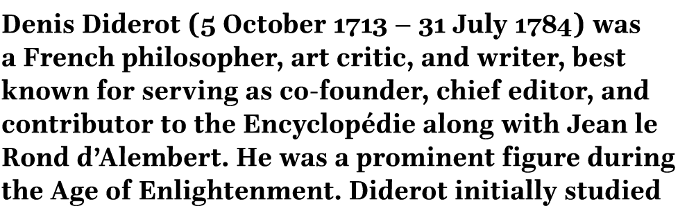
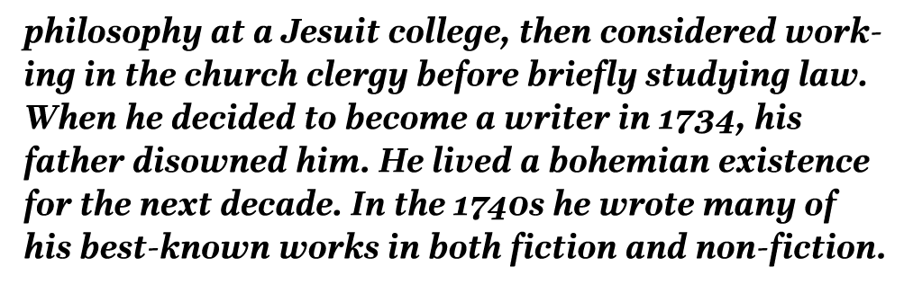
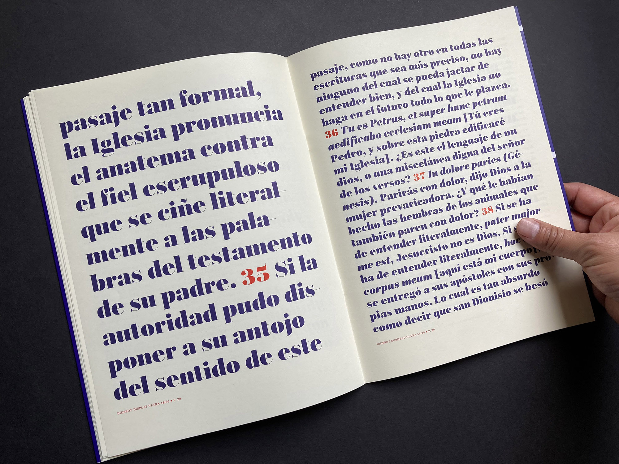
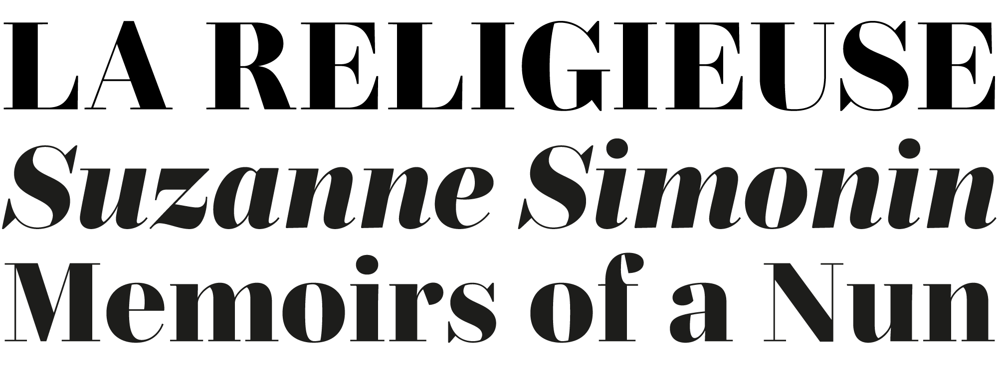
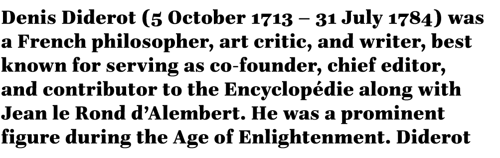
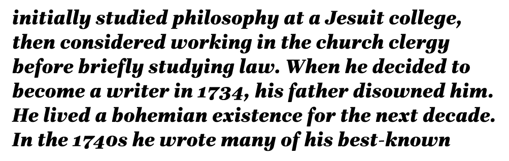
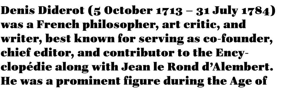
Diderot
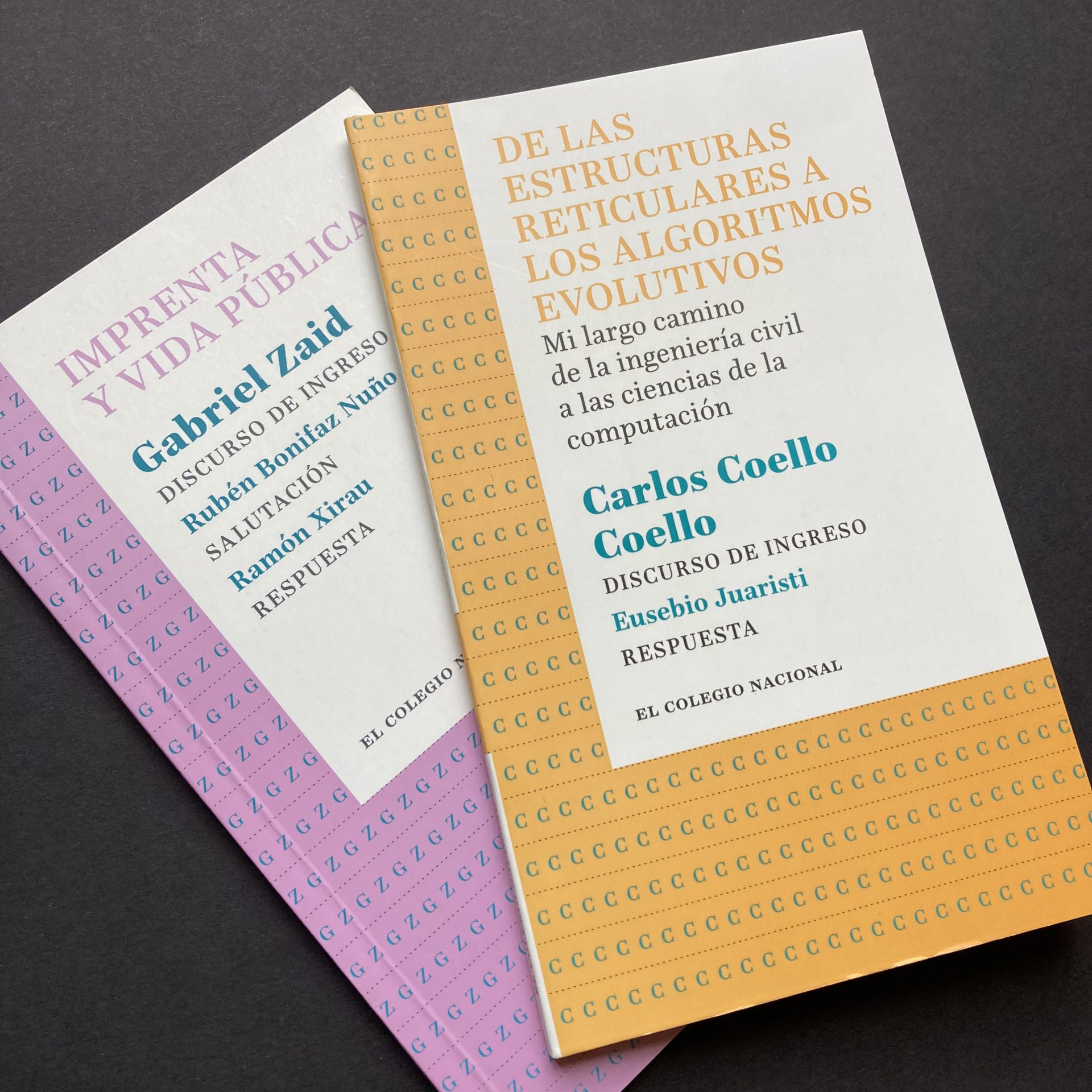
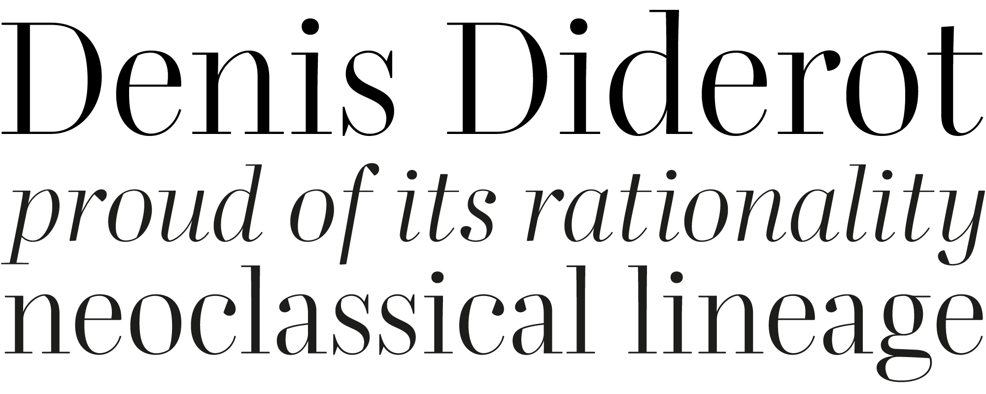
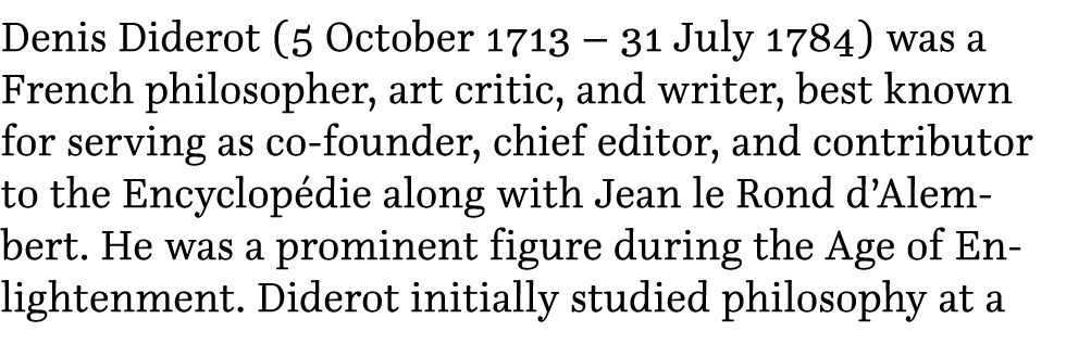
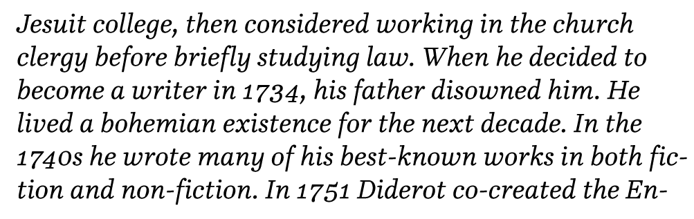
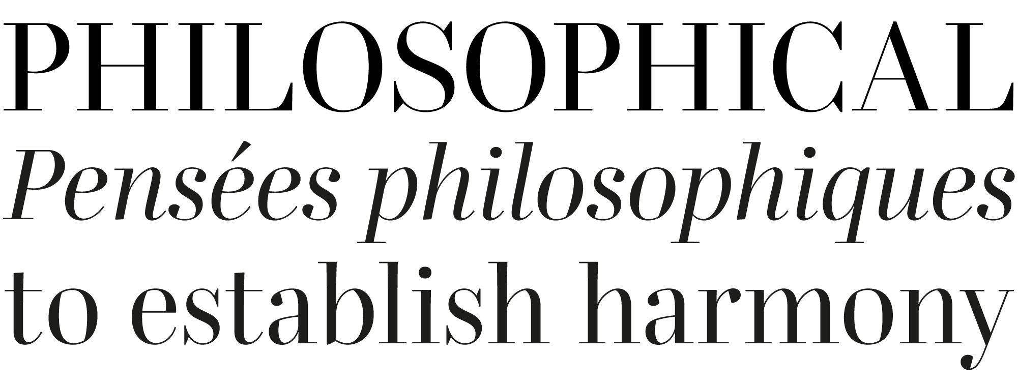
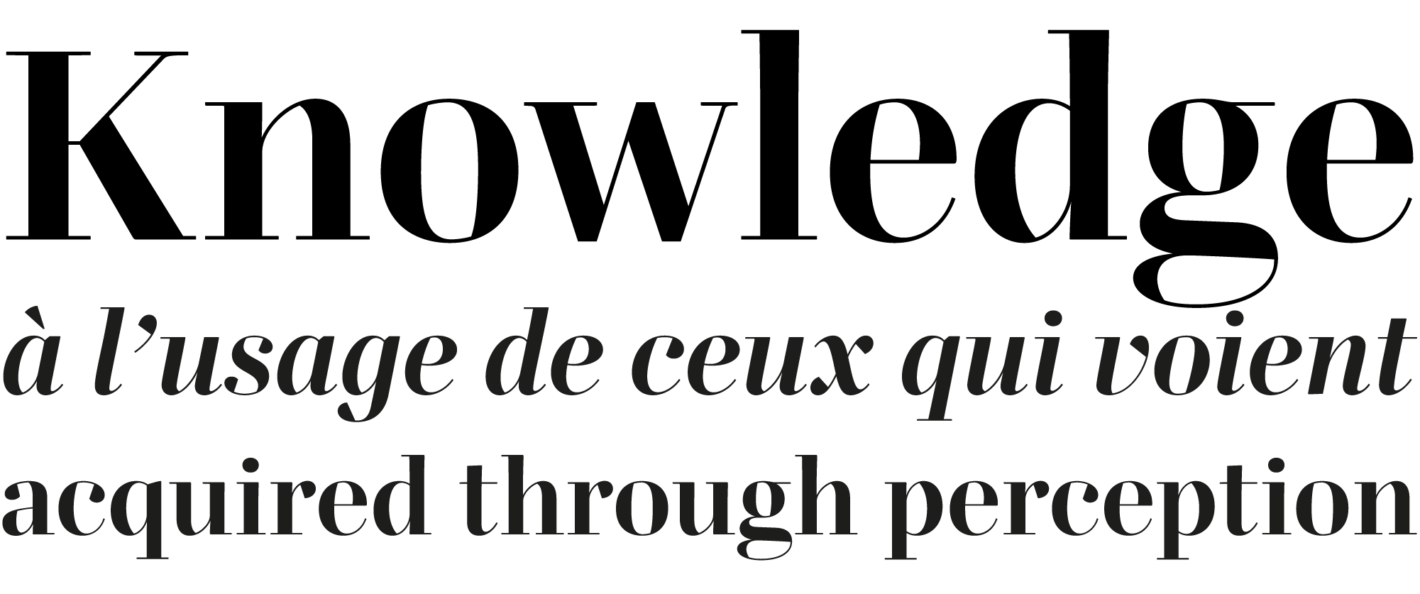
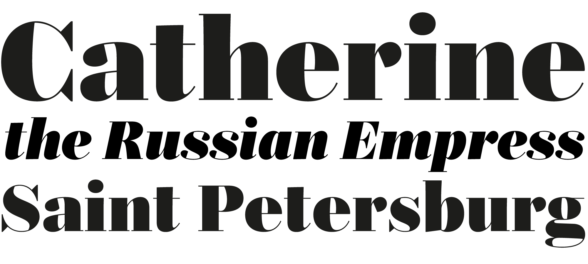
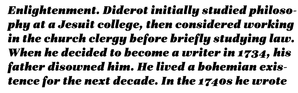
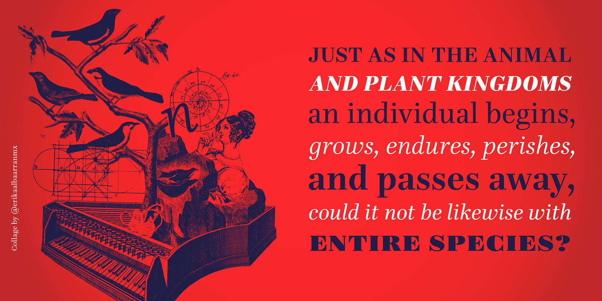
Diderot is an extensive type family proud of its rationality and neoclassical lineage. Although it is inspired by the Encyclopédie era, it is not a revival of an eighteenth-century typeface, but a contemporary interpretation of the enlightened spirit. As with others of its kind, such as Fournier or Baskerville, it is markedly vertical, but it differs from them in three fundamental ways: 1) unbracketed serifs, popularized at the end of the century thanks to Didot and Bodoni; 2) in the Text fonts, robust strokes to favor legibility; and, 3) the daring alternation of angles and curves, particularly visible in the Display fonts, lending unexpected vitality to the geometric coldness usually seen in neoclassical and romantic typefaces. It is appropriate for composing literary, essayistic, philosophical works and, in general, to metaphorize reliability, coherence, wit and elegance. It currently consists of 36 fonts in OpenType format (.otf) divided into three subfamilies: Diderot Display (for 48 points or more), Diderot Subhead (around 24 points) and Diderot Text (ideal for 12 points). It is also offered as a variable font (VF), a format that compiles the 36 variants into only two files, allowing the user to choose in some applications (such as Adobe InDesign and Illustrator; Affinity Designer, Photo and Publisher) versions suitable for any point size between 12 and 48 points, as well as hundreds of intermediate weights between Regular and Ultra. Each of the 36 fonts consists of 1140 glyphs, including diacritics to write in a wide variety of languages that use the Latin alphabet, including Vietnamese, as well as authentic small caps, various sets of numerals and uppercase punctuation, accessible in software that recognize OpenType substitutions. ¶ Diderot es una extensa familia tipográfica orgullosa de su racionalidad y de su linaje neoclásico. Si bien está inspirada en la época de la Encyclopédie, no es un rescate de algún tipo de mediados del siglo XVIII, sino una interpretación contemporánea del espíritu ilustrado. A semejanza de otras representantes de su género, como Fournier o Baskerville, posee una marcada verticalidad, pero también se distancia de ellas en tres aspectos fundamentales: 1) remates sin transición, popularizados en las postrimerías de la centuria gracias a Didot y Bodoni; 2) en las fuentes para texto, trazos robustos para favorecer la legibilidad; y 3) una audaz alternancia de ángulos y curvas, particularmente visible en las fuentes para títulos, la cual infunde una inesperada vitalidad a la frigidez geométrica que normalmente padecen los tipos neoclásicos y románticos. Es adecuada para componer trabajos literarios, ensayísticos, filosóficos y, en general, para metaforizar confiabilidad, coherencia, ingenio y elegancia. Actualmente consta de 36 fuentes en formato OpenType (.otf) divididas en tres subfamilias: Diderot Display (para 48 puntos o más), Diderot Subhead (alrededor de 24 puntos) y Diderot Text (ideal para 12 puntos). También se ofrece como fuente variable (VF), formato que compila las 36 variantes en únicamente dos archivos, lo que permite que en algunas aplicaciones (como Adobe InDesign e Illustrator; Affinity Designer, Photo y Publisher) el usuario elija versiones idóneas para cualquier puntaje entre los 12 y los 48 puntos, así como cientos de pesos intermedios entre Regular y Ultra. Cada una de las 36 fuentes consta de 1140 glifos, entre los que se encuentran diacríticos para escribir en una gran variedad de lenguas que usan el alfabeto latino, incluyendo vietnamita, así como versalitas auténticas, varios juegos de números y puntuación para mayúsculas, accesibles en programas que reconozcan sustituciones OpenType.